

Zelos Nova 2 Review | These Insane Watches Should Be Way More Popular
(This page features affiliate links, for more information click here.)
The dial is the most important aspect of any watch. The dial, or face, is perhaps the only part that can make or break a watch’s visuals, and a great one can help mask the piece’s other deficiencies.
For several years, that’s been the case with the highly popular Seiko Presage Cocktail Time. These mid-tier dress watches have bang-average specs and bland, cheap case finishing, which you’d think would be a recipe for disaster.
However, they also have exquisite dials that basically carry the whole package. For the price, the Cocktail Times are pretty special, but that’s not to say they satisfy everyone. In fact, for many in the watch community, the uncharacteristic large diameter, the boring bracelet, and the measly Hardlex crystal were enough to cut the Cocktail Time from their shopping list, despite its beauty.
What if Seiko didn’t cheapen out on the other areas, though? What if they actually gave you a classically-sized Presage with a sapphire crystal, a wearable band, and a dial just as good...if not better.
Zelos Nova 2 Review
Well, you’d probably end up with something like this. This is the new Nova 37mm from Zelos. That’s right, Zelos. The same brand that brought you big-ass tool watch designs.


Now, in truth, I have no clue if the creator of this had the Presage in his crosshairs; likely not. But, the final result is uncannily similar. It’s a retro-inspired dressy design with a slim case, available in a range of highly elaborate dials and at a reasonable sub-$1000 price point. The blue version, in particular, immediately reminded me of the Presage. Ok, these Zelos watches do cost a fair amount more than the Seikos, but that makes sense if they have better specs, right?
When Zelos emailed me asking if I wanted to review this, this same sort of questions flashed through my mind...could this be the perfect void filler for those after a snazzy dress watch without those downsides? Does it even look as good as the Presage in person?
Packaging
Out of the gate, I was in for a treat. The watches arrived in this very high-quality triple watch travel roll, which is worlds away from what even the more expensive Seikos ship in. While packaging isn’t a crucial element by any stretch, it’s nonetheless nice to have a storage solution with a great deal more practicality.

So here they are, the Nova 37mm in teal and salmon (aka blue and pink). Thanks to Zelos for providing these as review watches. They’re fine with me saying whatever I want about these watches by the way, as per my usual requirements.
Each of the watches in this collection have slightly different dial arrangements, so I went with the two I thought looked the best.
Watch Strap
The first thing that hit me, aside from the dials, which we’ll get to in a moment, was surprisingly, the smell. Indeed, I got this major whiff of leather as I unboxed these, which is usually a pretty assuring sign. There are no plasticky bands present here, as each of these shipped on a black Horween leather band by default; Horween being a super famous tannery dating way back to 1905. Their stuff is still top notch to this day, these straps are perfectly supple, perfectly flexible, and, I’d imagine, highly durable in the long run. While the company is old, the straps do have modern quick-release springbars, so you can switch them out easily.


My sole complaint is that the custom Zelos buckle appears to be the same, angular oversized one as used on their other watches, which completely clashes with the elegant styling of the Nova 37mm. It’s brushing doesn’t match up to the polished case and overall, it’s a bit of a baffling oversight in my books. A more streamlined clasp would surely be the way to go.
Dial Design
Either way, these watches still blew my socks off . Given that these cost like 700 quid, I was, of course, expecting them to look good. I mean, it had better look good for that much, right?


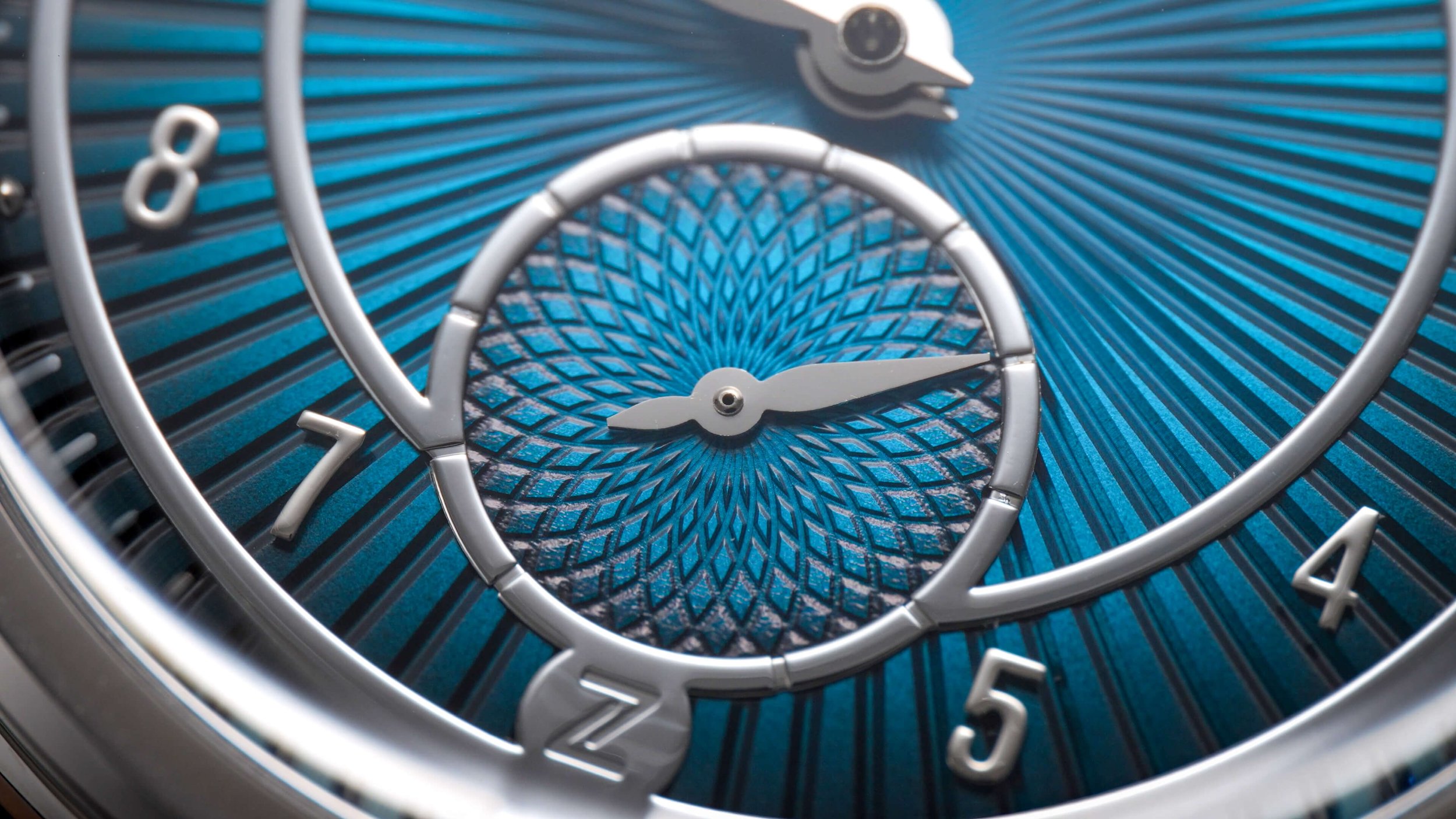
But yeah, these honestly look like they cost way, way more expensive than that. Now, I’m not sure how the Seiko dials are manufactured, but these Zelos dials are engraved using CNC machines (basically fancy cutting computers), which gives these patterns a much more three dimensional look than even the Cocktail Times.
The cutouts are much deeper and the resultant light play is something very, very special. They aren’t just cut nicely, both options retain the same sheen as a traditional sunburst watch, so you get this jazzy, sparkling effect as you move them.

Zelos has experimented a great deal with dial materials and finishes over the years, I looked at the Eagle 2 on my unboxing channel, which also had some ‘interesting’ things going on, shall we say. The Nova 2s though, they look super premium and luxurious, there’s no other way to explain it.
Case & Dimensions
Part of that is down to the case. Now proportionally, it’s got the whole classic, dress watch theme on lockdown. It’s exactly 37mm wide, with a similarly compact 43.8mm lug to lug measurement, meaning the watch is ideal for average and smaller arms or those after a retro hit. What’s even more ideal is the thickness. At under 9mm, including the pretty high crystal, and about 7.2 without it, this watch is one of the thinnest I’ve ever reviewed, especially for a mechanical timepiece. In fact, the unusual flush-fit case back is the flattest I’ve ever seen, giving the watch an immaculate on-wrist profile. If your sleeves get stuck on this thing, your tailor is the one at fault!


Both are a dream during usage, and they certainly make a statement, no doubt about that. It fits my 6¼ inch wrist fairly well, with no overhang, and the size truly suits the design. You big-wristed folk have had all the fun with the Presages in the past; now it’s our turn!
The rest of the case is more reserved, with a glossy finish throughout, though the indented two-step lugs help contribute to the Art Deco vibes present. It’s simple yet sharp and appropriate.
Movement
This sleekness is, in part, due to the choice of movement. In here is the ETA 7001, a Swiss, hand-wound movement that initially hit the market back in 1971. At a mere 2.5mm thick, this mechanical gem is thinner than most quartz modules, and it also looks much prettier, as you can observe through the exhibition rear. From what I can tell online, this storied movement has a great reputation, though I couldn’t find any reliable information about its accuracy. I know lots of other brands opt for this movement when they want something slim, but I think it’s the ideal choice for the Nova 37mm.

Beat rate isn’t so much of a factor with this one, as the second hand is far from prominent, tucked away in the subdial at the bottom center. Perhaps this is a good thing. While clean and stylistically fitting, the hands are nonetheless simplistic and potentially the weakest part of the Nova 2. The seconds hand, in particular, is just a flat block, which doesn’t exude quality. Meanwhile, the complete absence of lume isn’t exactly a surprise, given the early twentieth-century design cues, but it should definitely be noted if you plan on picking one up.
Dial Details
My main pain point with previous Zelos watches, aside from their extreme designs, which sometimes stray into garishness, has always been how their applied detailing is done. I think the metallic trims they use on various parts of the dial tend to look cheap. For whatever reason, I feel these curved surfaces just don’t look as pleasing as the flat ones used by most brands, especially the silver-colored strips used to create the Zelos logo on most of their watches.


To me, the Nova 37mm marks the first time I’ve felt that the detailing suits and positively contributes to the design. The smooth, rounded borders are perfectly juxtaposed against the aggressively cut dial textures. Even the numbers, constructed in the same manner, are presented in a tall Americana typeface that seamlessly slots in. What’s even more pleasing is that the logo, which I’m not very fond of, has been downsized and repositioned to the foot of the dial, leaving the upper half completely clutter-free.
Legibility
As you can tell, legibility is still far from this piece’s strong suit. I don’t think it’s as bad as some videos make out; a lot of creators seem to rely on small light sources, which create a harsher contrast, causing these elements to disappear completely. Nevertheless, even under more flattering light, the salmon version, in particular, remains tricky to read at a glance. It’s an inherent weakness and byproduct of these concave applied strips.

Final Thoughts
Despite this downside, I frankly don’t care. In fact, out of the two, I feel more drawn to the salmon, which boasts easily the classiest pink tone I’ve seen on a watch. Together with the texture, it feels so unique, so niche and specialized, that it instantly became my favorite dress watch, no question.
Up close, the guilloche pattern is probably most comparable to that on the new Citizen Tsuyosa Small Seconds, as the size also increases the further outward from the center you look. Nevertheless, there’s much more of a glisten this time around, furthering the dressy aura. It then transitions to a flatter area at the chapter ring, while the minute track is just an extension of this pattern, but with recesses punched into the shapes sitting at the circumference. It’s spectacular; I will be whipping this watch out at the first opportunity I get. Nobody else in the room will be wearing anything quite like this.

While still very elaborate, the teal version has that blue, Cocktail Time-esque sunburst with striking deep radial grooves. Because of the darker tone, legibility is less of an issue here, as there’s a slight fume effect present, too, with the blue descending to a dark grey at the edges. I think this marginally more restrained dial is likely to appeal to more of you reading. It still oozes sophistication, offering up more defined rays of light on the dial, though the distinctiveness of the salmon still edges it for me.
Some of you will think these are tacky, with texture for the sake of texture, and I get that perspective. As I alluded to earlier, normally, that’s me too. But here, I think Zelos has just about nailed the landing.
It’s surely meant for those of you who want to spend out on something that will get comments and, ideally, compliments. Due to the extremity of the design, I think this is one of very few watches that might be able to actually invoke that level of curiosity.
The most comparable Presage to the Nova is the lesser-known 38.5mm version. That one has a similarly numbered, retro design, as well as a textured dial. I haven’t tested that model just yet, and it may be a good budget alternative, though I doubt it rivals the finesse of the Zelos Nova 37mm.