Timex Q Falcon Eye Review – Is The Beauty Only Skin Deep?
(This page features affiliate links, for more information click here.)
So, there’s a certain Q-Timex that nobody seems to be talking about. That being the elusive Falcon Eye, which I think is quite possibly the best-looking out of all of these reissue watches. It’s sized well, has a slick, sporty aesthetic and one of the coolest dials I’ve seen to date. So cool in fact, that I decided to pick one up for myself. However, I’m wondering…is the beauty just skin deep?
That was one of the themes that came up with the other Q-Timex watches. Many people liked the way they looked, but some weren’t willing to cough up the cash for what was essentially a basic quartz watch.
In this post, I’m going to give you the lowdown on this one, to see if the conclusions are the same. I purchased this with my own money on Halloween, for just over £100 on discount; normally, it’s closer to £160. I’ll link the watch throughout this review.
Packaging
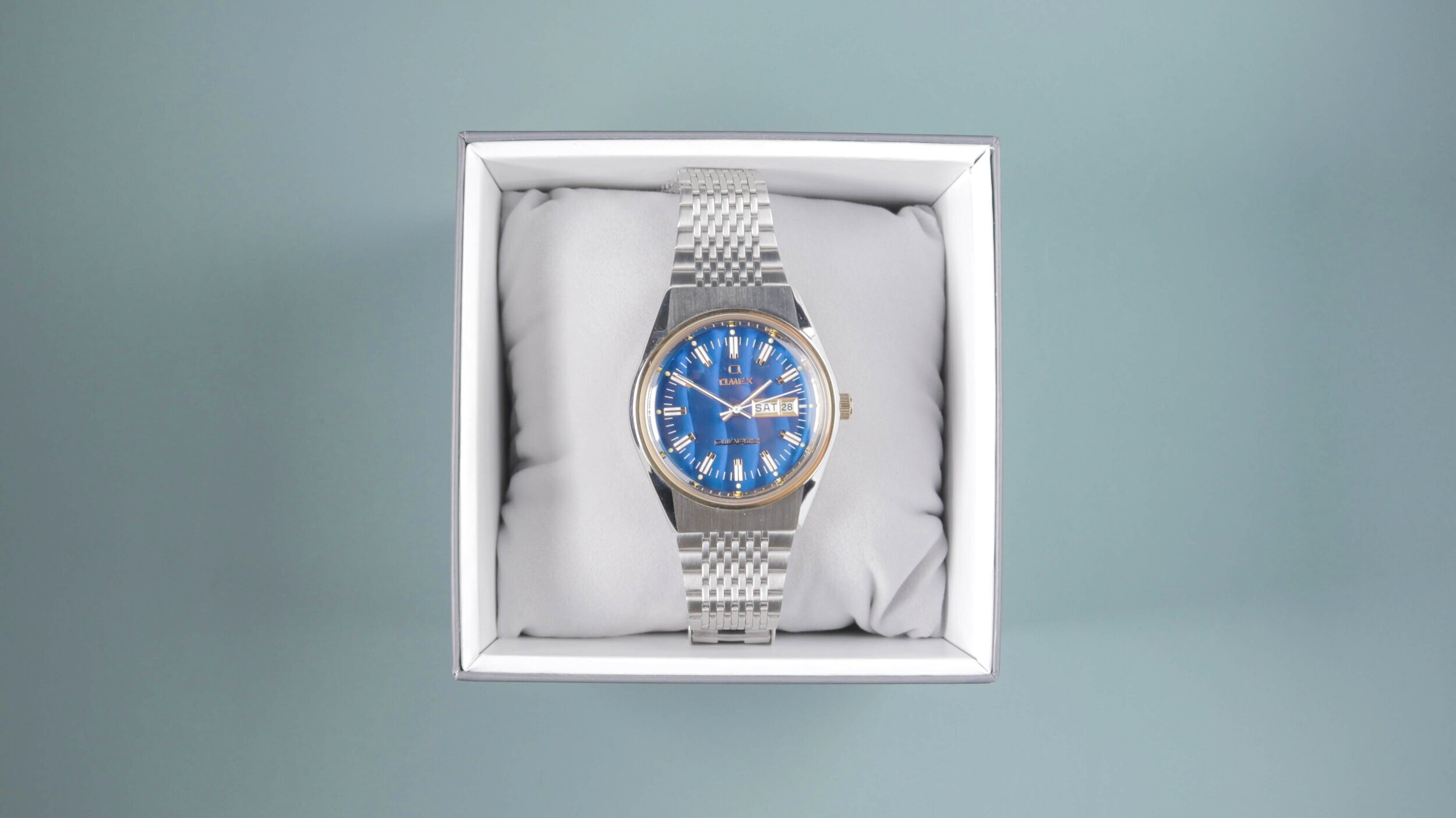
The watch arrived in a regular Timex box, which I felt was a tiny bit of a missed opportunity. I half-expected this to come in some sort of retro box, akin to the art style used in the marketing materials for this wristwatch. Nevertheless, the packaging is arguably the least important thing; as often, the more that is spent on packaging, the less money goes into the actual watch.
Watch Sizing & Specifications
|
Specifications |
Timex Q Falcon Eye |
|
Lug to Lug |
44 mm |
|
Case Diameter |
38 mm |
|
Case Thickness |
13 mm |
|
Lug Width |
18 mm |
|
Water Resistance |
50 metres |
Upon first inspection, the watch appeared a little larger than I had anticipated. Indeed, the watch has the 38mm diameter and 13mm depth as advertised. However, the 44mm lug to lug size is somewhat deceptive. The concealed lug design gives the piece notably more wrist presence. I’d say on-wrist, it wears more like a 39 or 40mm watch and unfortunately, those concealed lugs make the watch sit a little awkwardly on my small 6.25-inch wrist.
That combined with the bracelet, which I’ll touch on in a moment, has unfortunately made this a no-go for my wrist; which I didn’t expect when I saw the modest sizing online.
Case Construction
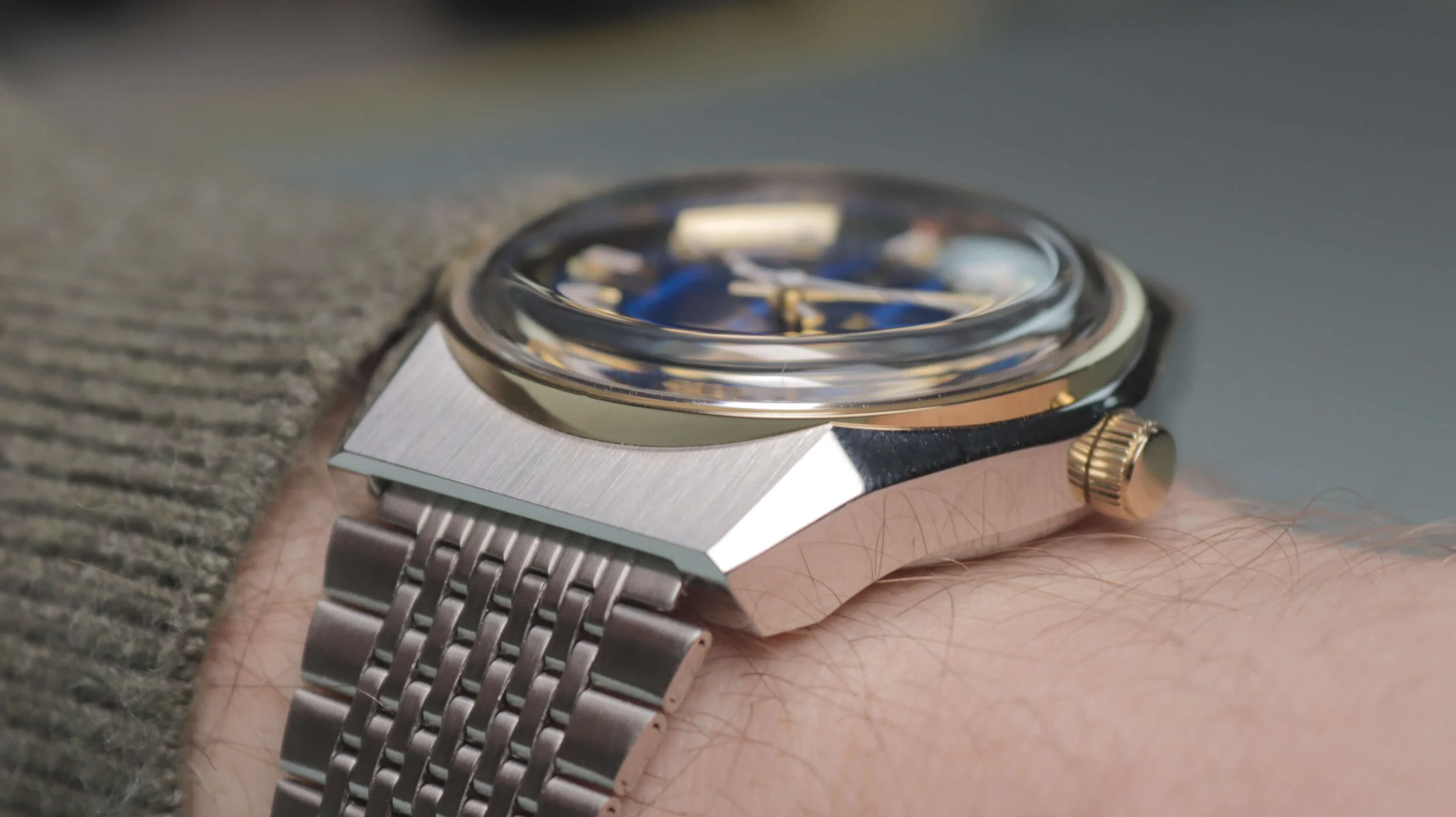
Thankfully, unlike the cheaper brass Timex offerings, this one is fully stainless-steel, which is the standard material used in most wristwatches. For the most part, this one has a polished finish, aside from the sections above the lugs, which are showcased in a vertically brushed finish. Even though it doesn’t fit me, I do like the shape of the case, which has a sporty, angular lug profile when viewed at 90 degrees.
While it feels fairly substantial for a quartz watch, there is one part that bugs me a little. If you look closely at the bevelled edges, as the case drops off towards the lugs there is a ridge at each corner; as the case rides up the bezel slightly. This leaves an unusual edge in the polishing, which looks a bit sloppy, as it isn’t as precise as some of the other sharper edges elsewhere on the case. At a glance, it could almost look like a fault with the way the case has been moulded. I’d rather this be either neater and sharper, like the stock images portray, or completely smoothed out.
The rear of the case is pretty cool, featuring a brushed finish, with a quick-change battery hatch to boot. While it does protrude slightly, you can’t feel it when on-wrist and it will allow you to switch out the cell when it finally expires. The screw-on case back ensures you get a reasonable 5ATM of water resistance, which is fairly good for this style of watch. This means you could try taking this swimming, just don’t expect anything spectacular.
Bracelet
Before we talk about the best part of the watch, we have to bring up arguably the worst part.
The bracelet…it’s terrible. It looks pretty cool, fitting the aesthetic rather nicely but is constructed of cheap-feeling folded links and feels like it’s been taken straight from a £15 Casio. I could be wrong, but from what I can gather, these links aren’t removable either; so despite the adjustable slide-clamp mechanism, it doesn’t go small enough for my 6.25-inch wrist. The side with the hook is just a fraction too long. You probably could replace this bracelet for an alternative 18mm option, or employ some sort of hack to break off the links if needs be. However, it’s still disappointing for a watch at this price point. I anticipate this stock band could also be a hair-ripper, so if you have furry arms, be warned!
I was hoping this was a cool watch that could suit smaller wrists than mine, however, that doesn’t seem to be the case.
Watch Glass
Some of you may be equally frustrated by the crystal choice too. This is a piece of heavily domed acrylic, which will likely scratch up very quickly if you are wearing the watch regularly. It does suit the retro aesthetic and gives good visibility at angles, though my preference certainly lies with more scratch-resistance crystals.
Dial
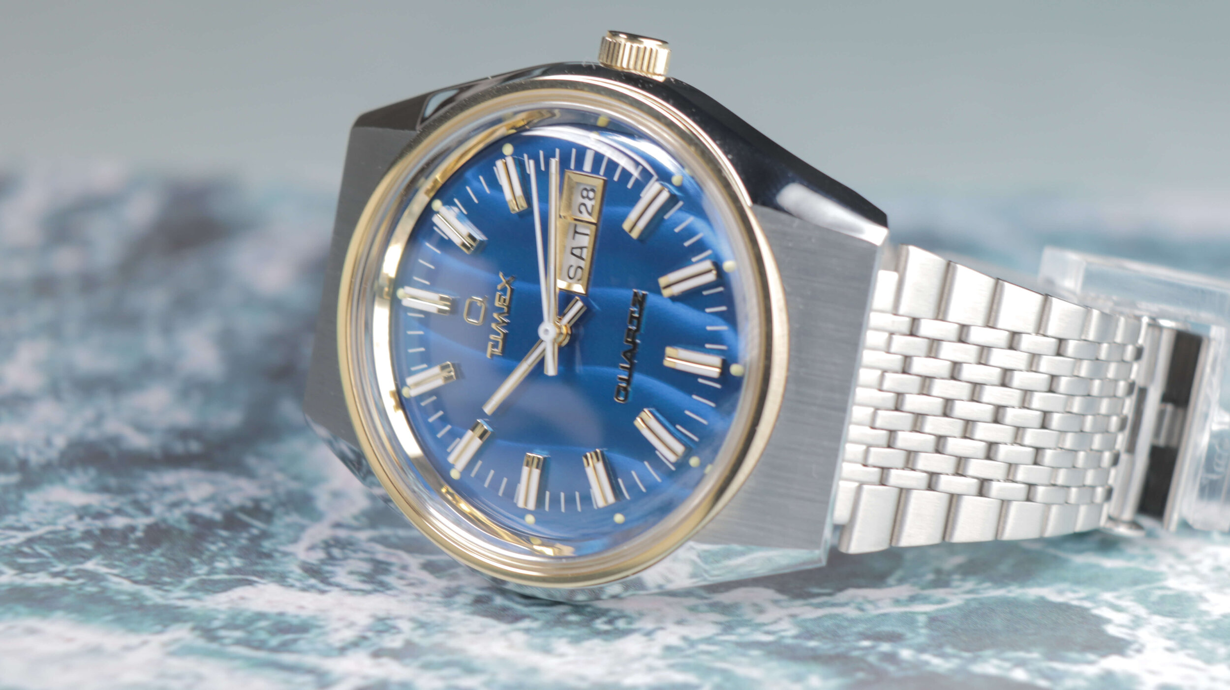
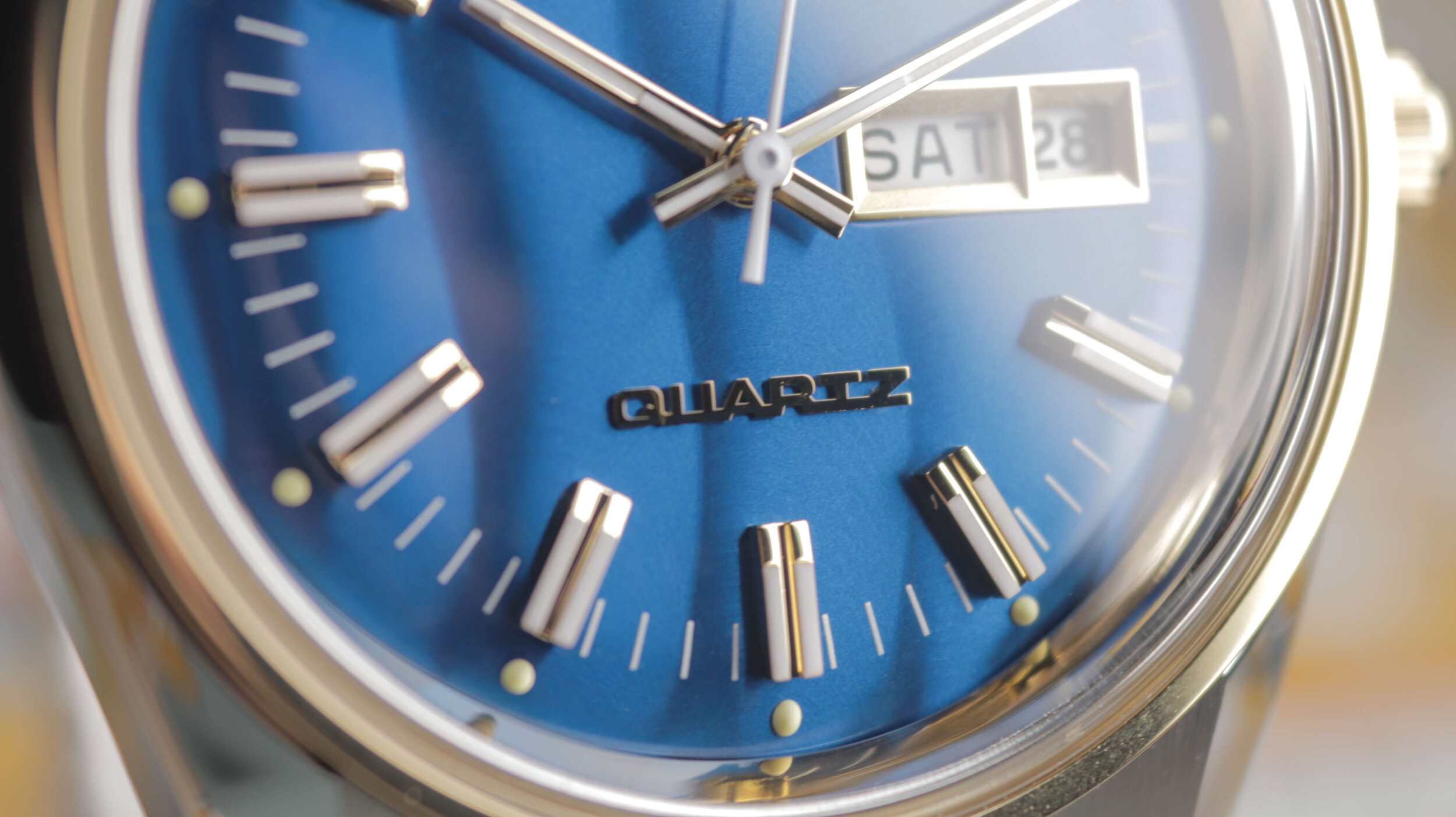
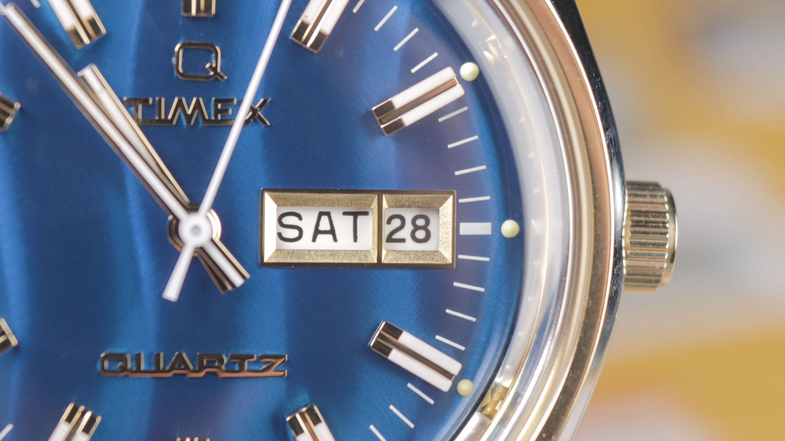
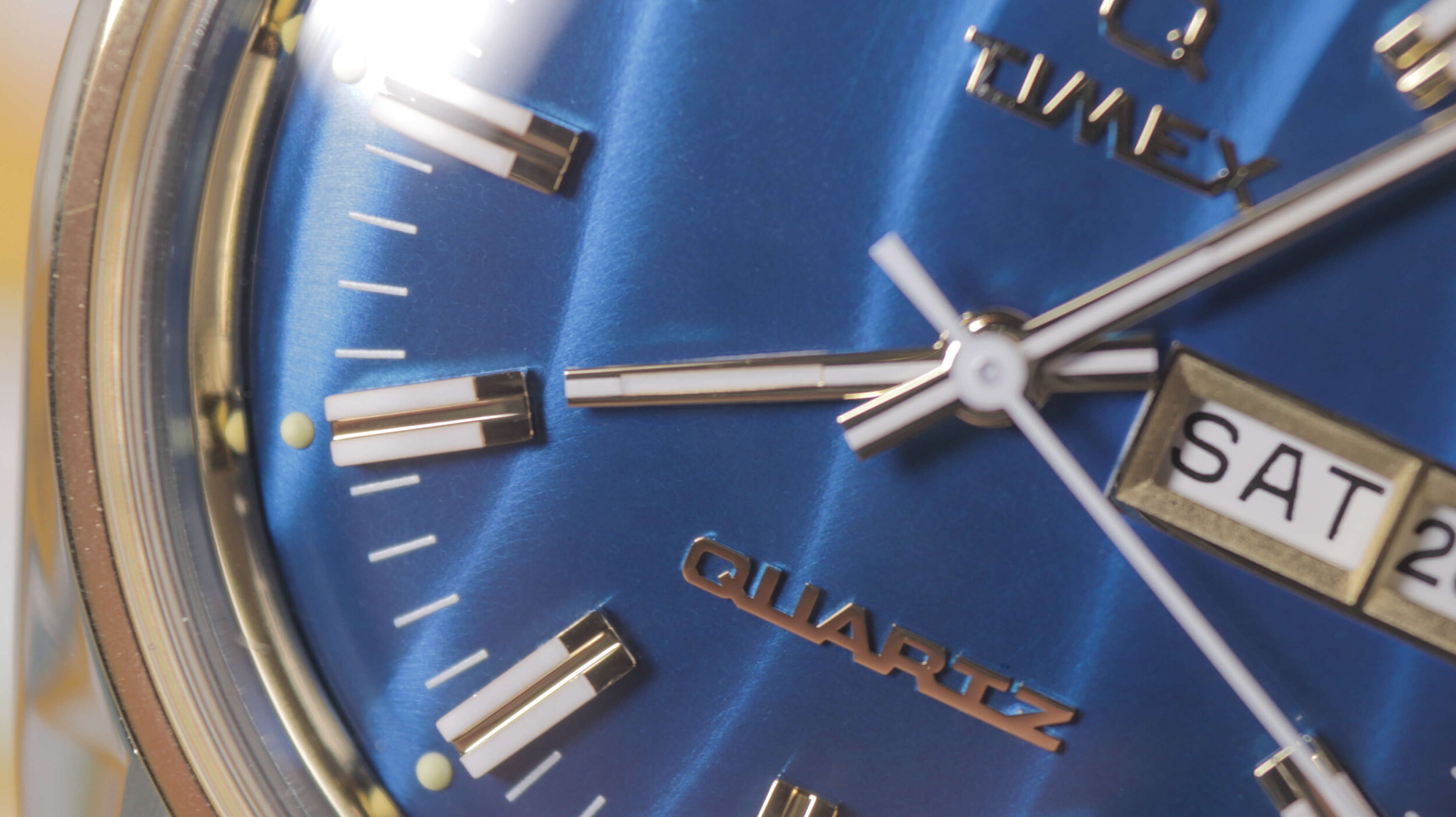
Without a doubt though, the star of the show is what lies beneath that acrylic. This has to be the single funkiest dial I have ever seen on a wristwatch. Some watches look much better in pictures than in real life, however, I can confirm this blue wave pattern is just as bright and bold in person. From what I can gather, the shape of these waves is unique from piece to piece, as mine is arranged slightly differently to that featured on the stock images. Regardless, they still glow beautifully in the light as you rotate the watch; almost looking like those waves are moving horizontally across the dial. How exactly this effect is achieved, I’m not sure; but if you’re anything like me, this has some sort of boyish charm and invokes memories of the holographic Pokemon and Yugioh cards from my youth.
I particularly enjoy the way it falls off steeply at the circumference, with the small lume pips protruding outwards slightly, which accentuate that curvature even further. The bright blue colour does a great job of enhancing that retro vibe, especially when combined with the multitude of gold accents on the rest of the watch.
Indeed, several other areas do their best to grab your attention. Not only do you have the gold bezel and crown, but the logo, hands, date window and indices also feature a similarly toned finish. Overall, this results in a very extravagant, flashy look that you’re likely to either going to love or think looks tacky.
Upon opening the box for the first time, I was immediately impressed with it and the attention to detail of the design. I love the cursive font type they’ve utilised for these Q Timex watches, I think the conjoined lettering perfectly fits the retro theme that they’re shooting for with this model. Despite this being an affordable watch, they’ve also taken the time to add a gold surround to the date window, which looks great; though due to the movement selection, it is positioned more centrally than I’d perhaps like. The standard white wheel is a good choice though, as it blends in with the white sections already present on the hour markers.
The hands also look great, with a stretch of luminescence down the centre of each; aside from the plain white second hand. In low light, you get some visibility, but this Q model doesn’t have the Indiglo function found in many other low-end Timex watches.
Quality Control
And yes, despite the steel construction, there are a few things that reveal this watch was still built on a budget. First up is the quality control. When you look closely, you’ll notice that alignment is a slight issue. On this unit, the faceted 10 o’clock marker has a groove that isn’t quite central, leaving one side marginally slimmer than the other. It’s a similar story on the hour hand, where the lumed section isn’t perfectly aligned with the rest of the white paint. Nevertheless, these minor inconsistencies are often going to be there on budget watches and it’s not my main issue with this piece.
Movement
My main gripe is the movement. Timex has chosen to go with a quartz movement, as the Q-Timex branding indicates. To be clear, I don’t have anything against quartz movements in principle. In fact, the watches I wear most regularly tend to be battery-powered as they tend to be thinner and are much more accurate than anything mechanical.
Nevertheless, they have choked with the one in this Falcon Eye. Not only is it relatively loud, luckily not quite on the same level as their Weekender, but it’s also poorly aligned and quite inconsistent. The second-hand keeps hitting between the markers at varying distances as it moves its way around the minute track. Sometimes it’s close to the marker, while at other times it’s a mile away.
While this issue is forgivable on cheap watches, the more you start to spend, the more frustrating it becomes to see it repeatedly miss. For quartz watches at over £150, I’d like to see more brands, including Timex, put more resources into ensuring better alignment. I wouldn’t be surprised if that’s more difficult than it sounds, but I hate the back and forth of returning and re-purchasing watches to track down a unit that hits the markers consistently. I mean, what’s the point in having the markers if they’re never being hit, you know?
If this watch was viable for my wrist, I’d have to get this replaced to try and find one that didn’t annoy me in that regard.
Comparison
How does this stack up versus some of the other Q-Timex lineup then?
Well, I can give you some general observations if you’re considering multiple options. If you’re looking for a blue dial watch, I prefer this one over the other sporty Q-Timex for one simple reason. If you look closely at that other model; you’ll see that the blue-indigo coloured dial doesn’t match the tone of the blue on the bezel. Once you’ve noticed it, you just can’t stop seeing it and it seems like a bit of an obvious oversight on their part. This Falcon Eye doesn’t have that issue.
If you have a small wrist like me, chances are that the regular Q Timex is going to fit you better, as the lugs taper off at what appears to be a steeper angle; meaning you shouldn’t get the large gap between the lugs and bracelet; as I did with this Falcon Eye.
Something else to note is that an error on the Timex website has the original Q-Timex listed as having less water resistance than this model. In reality, both watches have the same 5-bar water rating; so don’t let that sway your decision unnecessarily.
Outside of that, it has the same materials, the same movement and very similar sizing.
Final Thoughts
Overall, I probably like the execution of this piece more than the former, as it has more personality and originality to it and if it fit me, I’d probably keep it and wear it occasionally. I’d also ensure you try and track down some sort of discount code before pulling the trigger, as £159 is still a fair chunk of change for a quartz watch with some of the rough edges I mentioned previously.
I’m looking forward to seeing what creative designs Timex come out with next, to see if there are any that will fit me.


