Spinnaker Hydrofoil Review - Has Spinnaker Learned From Its Mistakes?
(This page features affiliate links, for more information on them click here.)
If you’re anything like me, you’re an avid bargain hunter. Often we end up looking at big brands who can pump out some great pieces for low prices, given their large infrastructure. Microbrands, however, tend to be hit and miss. Let’s be honest, a lot are out there to rip you off.
Last time I tried Spinnaker, the watch was strong in terms of specifications, but when I looked at the dial it certainly wasn’t to my taste.
Yeah, it wasn’t exactly a looker. It looked like 20 people had tried to design one watch, which didn’t end well.
Despite this feedback, Spinnaker reached out again, asking if I’d like to check out their latest model; to see if I thought it was an improvement. They sent me some product shots and the watch did look substantially different, so I figured what the heck…let’s give them a second chance. What could possibly go wrong?...actually not much in this case!
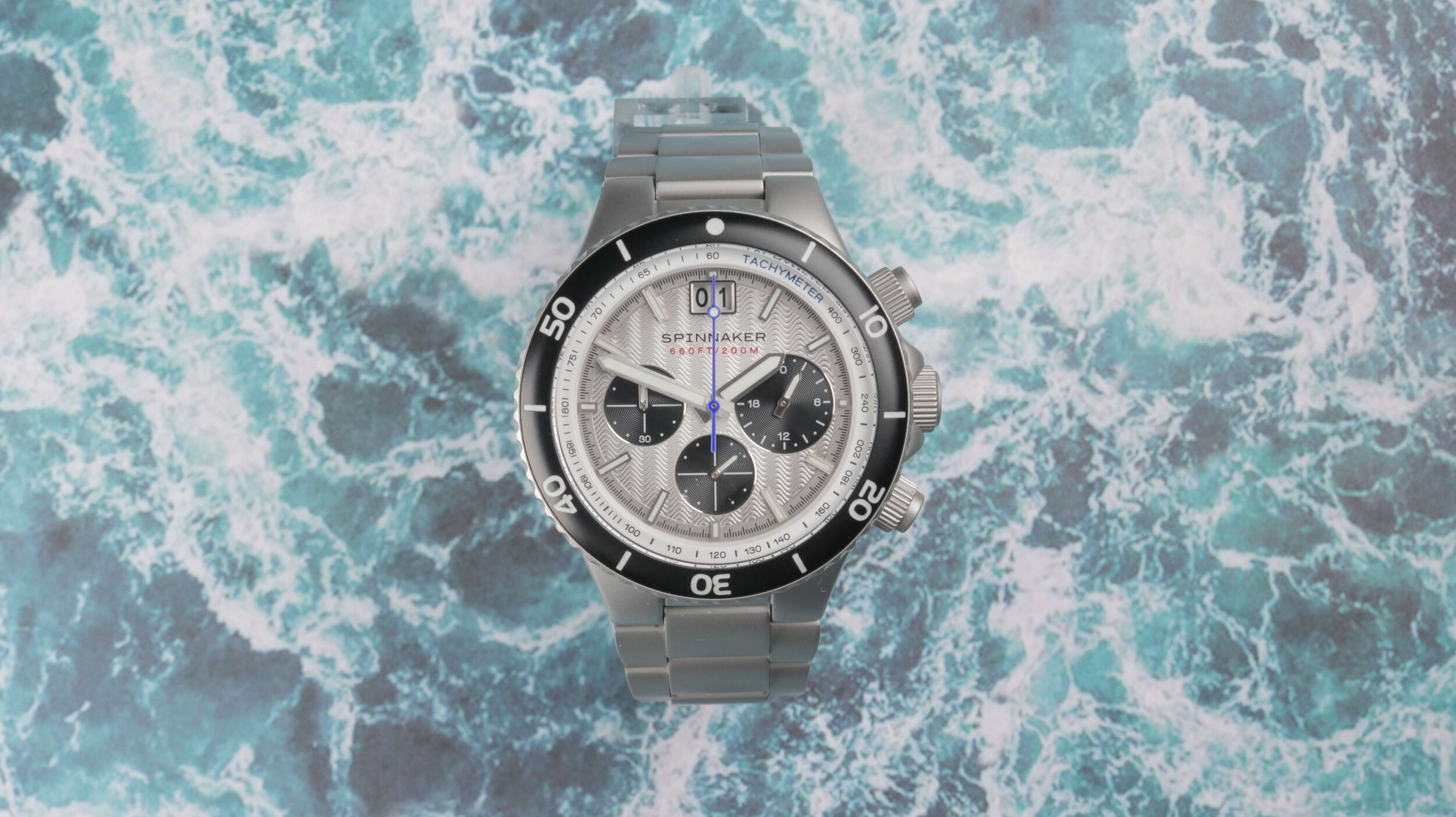
So, this is the Spinnaker Hydrofoil chronograph. As you can see this is a sports diver, with a full matte case and reasonably flashy design.
Dimensions
As with the previous Spinnaker, this one is better suited to larger wrists, with a 43mm diameter, 13.9mm thickness and a 50.3mm lug to lug. This puts it out of reach for my skinny wrists, especially when combined with the weight, which is well over 150 grams with the supplied bracelet.
Case
This is the first time I’ve reviewed a watch with this blasted finish throughout the entirety of the body and bracelet and I have to admit it looks quite unusual. It reminds me of the finishing you might find on a concept watch, which may or may not appeal to your preferences.
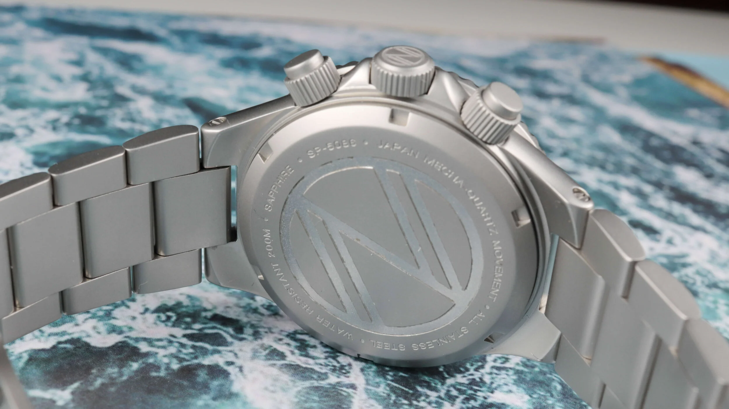
Fortunately, the sporty styling can house this nicely, without it looking too out of place. As with all of the watches under the ‘Dartmouth Brands’ umbrella, it feels particularly solid and the positives are compounded when you consider the screw-down crown and pushers. Each are highly grippy and generally work well, though the top pusher could do with some added responsiveness when using the stopwatch function; currently, it feels a little mushy when compressed, compared to the more distinct clunk provided by the lower button.
The screw-off case rear also helps this watch to reach the 200m water resistance mark; making it fully capable of all aquatic activities, outside of extreme deep-sea diving. You’ll notice both the crown and the rear feature a logo, which I first mistook for the ‘Z’ of the Zelos watch brand, though, on closer inspection, it looks like a double N; likely referring to the double N present in Spinnaker.
Watch Movement
Within you have the popular Seiko VK73 mecha-quartz hybrid movement. For around this budget, most automatic chronograph movements aren’t attainable, so this makes for an accurate alternative which still provides a chronograph hand that is smoother than traditional quartz. As with mechanical movements, I find that this movement also eliminates the possibility of a quartz tick that misses the markers.
Bracelet AND Bezel
The propriety bracelet integrates very well with the case, though it does restrict your options, as the awkward lug shape won’t fit regular straps. I’m wondering what exactly the drilled lugs are there for? This is a shame, as I could foresee a dark silicone strap looking quite nice here too, but luckily the stainless steel band included is very hardwearing indeed. It has solid links throughout and has a milled push-button clasp, which is perfectly adequate considering the cost of the watch.
A downside of the blasted finish is that contact points on the bracelet may become visible over time, you can see one example of that on the central link positioned just below the case. Whether the watch arrived like this or if this was caused by me, I honestly don’t know.
The clasp has three micro-adjustment holes, along with a divers extension; which may or may not come in handy, depending on your needs.
It appears the bezel action is better than the Fleuss I reviewed previously, with this one having eliminated the back-play issue present in that model. This time I think it suits the overall aesthetic too. If you are interested in the Hydrofoil please feel free to use my discount code of ‘BENJA15’ for 15% off your next purchase on the Spinnaker website.
Watch Glass
A glorious piece of lightly domed sapphire crystal is what you can expect above the dial. This gives you that unbeatable scratch resistance, which is what you’d want when spending around £200 on a watch. It’s pleasing that Spinnaker hasn’t short-changed us here.
Dial Design
Ultimately, though, the crux of this post is the dial. This was the fatal flaw with the last model, so how does this one compare?
Well, for the most part, I think this Hydrofoil is better looking. It starts with a slim internal tachymeter than runs the circumference of the face, which utilises the same font as the rest of the text, to give some smart consistency.
The main texture is giving me real Miami Vice vibes here, with some bold wave-shaped corrugations that span the width of the dial. In bright light, you get a vertical shimmer effect that while flashy, certainly does make the watch stand out. I’d much rather have a watch that takes this approach, versus loading up on unnecessary gold plating and fake jewels, as is often the case with these lower-cost pieces. Further interest is added in the form of the gradual outward fading from white to a darker silver towards the edges and the raised, lumed hour markers which are precisely aligned.
There are a couple of parts that I’m not keen on. First of all, that double date window returns, with the large gap between the dial and date wheel. Luckily that applies to this colourway, as the thick border is somewhat concealed by the dial; though I would have preferred no window from an aesthetic perspective.
Additionally, you have unbalanced subdials, with the one to the right having a noticeably larger radius. I’m unsure whether this is a conscious design decision or if for some reason this is a necessity thanks to the movement (which I doubt), but either way, I think consistently sized subdials would look more pleasing to the eye. All three are embedded deeply into the dial, rocking the typical ringed engravings but also featuring glossy chamfered edges, which provide some shine in what is otherwise a rather matte appearance.
The blue second hand gives some added sporty colour and the luminescence is also very strong in low-light conditions. There’s plenty of it covering the hands, along with each index; meaning you’ll have no trouble reading the time.
Wisely, the main text is contained to just two lines below the 12 o'clock position, which is about the most I think this could get with to prevent it from looking as busy as the previous model.
Final Thoughts
The watch retails for a standard price of £250, though it’s kind of a fake retail price as there are always codes available. I’ll link one at the end of the article, along with the watch itself. That takes it down closer to the £200 mark.
On the surface, you could compare this to something like the Pagani Design Daytona that I reviewed a few weeks back and draw the conclusion that the Pagani offers you the same specs for less money; which is technically true. Nevertheless, that wouldn’t paint the whole picture in my opinion. While that Pagani offers a lot for under £100, in-person this Spinnaker looks and feels like a step up. The bracelet and case are better, the design is original and the water resistance is going to prove more dependable too.
Spinnaker like opting for these more experimental designs, which I think is generally a good thing and I feel like the Hydrofoil has landed on its feet rather than its face. Nevertheless, it’s not something I could see myself wearing regularly. I think it looks leagues better than the Fleuss Chrono but the sizing and style just don’t suit me and my wardrobe.
If you are interested in the Hydrofoil please feel free to use my discount code of ‘BENJAMINARTHUR20’ for 20% off your next purchase with Spinnaker.


