Nezumi Tonnerre Review - This Brand Listens To Feedback...Here Are The Results
(This page features affiliate links, for more information click here.)
Sometimes I get questions like "why are you so critical?" and "why do you nitpick good watches?" or occasionally the timeless "if you don't have anything good to say, then don't say it."
I'm sure the thought process behind these comments varies from naïvety to cynicism, but the reasoning really is straightforward. I want you to get a realistic, thorough look at the pros and cons of the watch, and, ideally, I'd like the products to keep improving.
Some brands get triggered by criticism and will stop sending review samples out to outlets that give negative feedback, preferring to control the narrative by restricting coverage to those who fall in line. However, others use their brains and have realized that perhaps the input from those whose job is literally to review watches could be valuable.
Nezumi Loews Chronograph
Nezumi Loews Chronograph Watch Box
The latter approach seems to have been the case with Nezumi, who've made some exciting alterations to their latest release after their previous effort did the rounds. I reviewed the Loews chronograph in mid-2020, and the title summed up my thoughts pretty well. The build quality was pretty solid from such a young brand, but I wasn't sure what made it stand out. There are tonnes of similar mecha-quartz faux-vintage pieces on the market right now, and that one just didn't offer a particular reason to pull the trigger.
12 months go by, and they email me again about a new addition to their lineup, the Tonnerre chronograph. At first, I fobbed it off and didn't read it thoroughly, expecting it to likely be another half-decent albeit unremarkable watch that wouldn't be of huge interest to my viewers. It fell through the cracks, basically.
When they sent a follow-up email a month or two later, I realized what a doo-doo I'd made. I took a look on the Nezumi website to see what they were raving about and was met by a striking timepiece that, from the product shots, looked much more refined than its predecessor.
I've got a small chronograph roundup in the works, and this seemed like a potential candidate for that. So, I took a punt and accepted their request. They sent this Tonnerre over, and the impressive final product is a testament to their open approach to criticism.
Watch Packaging
The packaging is an immediate upgrade, with a more premium box that puts many more expensive brands to shame. The felt lining and leatherette outer aren't so important in the grand scheme of things but do make for a pleasant unboxing experience that could leave a smile on the recipient's face.
Dimensions
I opted for the off-white creamy variant, reference number TQ1.102, which shipped on a black leather strap. You'll notice a third-party strap is fitted in most of the photos for reasons I'll mention later.
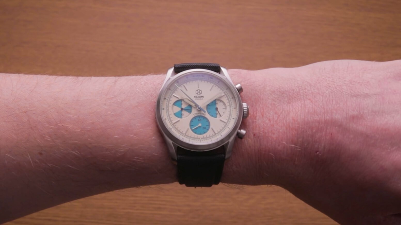
Regardless of customization, the Tonnere will have the same case proportions, at precisely 38mm across, a thickness of 11.8mm including the crystal, and a short lug to lug of only 45.5mm. What does this mean? Well, it means I finally have a chronograph that fits me. Sure, the Sea-Gull 1963 that I'll be featuring soon does a reasonable job of this too, but the lug to lug here is noticeably shorter, making the Tonnerre fit more compactly. For once, we possibly have a viable small chronograph on our hands!
Watch Case
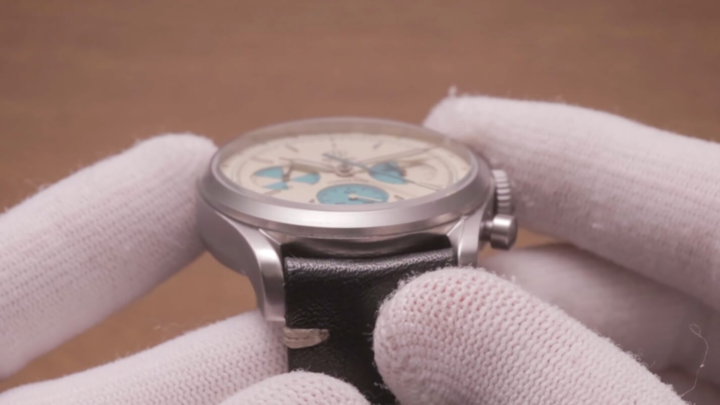
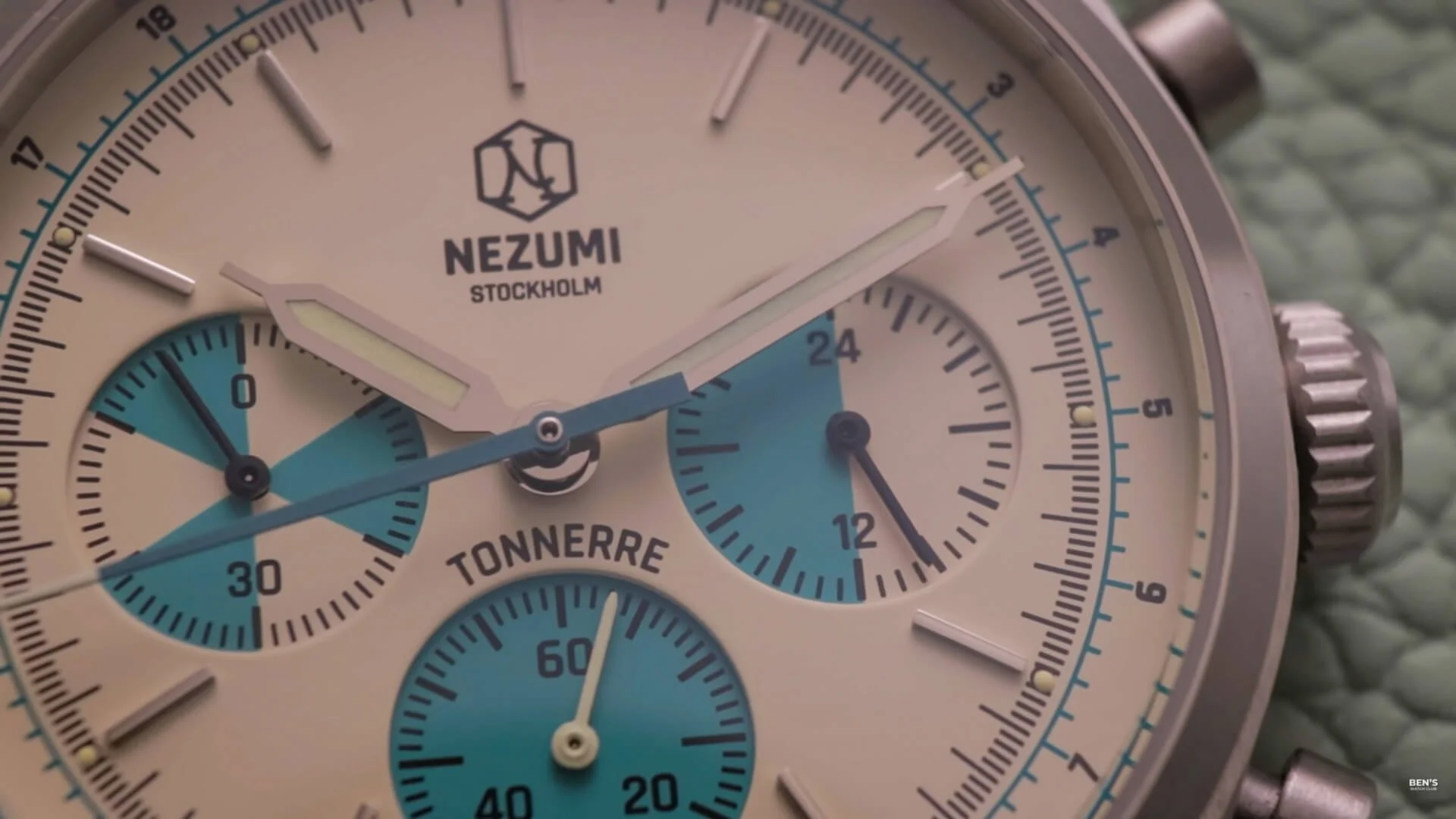
Unlike the Loews, this follow-up has a more consistent and better-executed feel with a fully-brushed look that pairs well with the nautical stopwatch theming. It feels exceptionally well built, with a weight well inside the Goldilocks zone, while the brushing has been completed to a standard more than adequate for a watch at this price point. It looks great under our bright studio lighting. The previous entry felt a little too bulbous, with a thicker stepped case shape, stubbier lugs, and a glossy finish that deducted from its elegance. The subtle alterations to this Tonnerre leave it feeling sleeker and better proportioned.
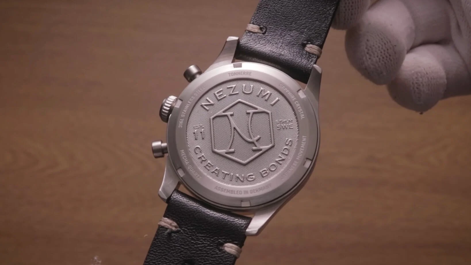
It shares some of the same characteristics as before, such as full steel construction and the 5ATM water resistance level accompanied by a screwed rear. Once more, we have a refined rear engraving, as well as a highly-responsive pusher and crown arrangement, which are a joy to operate. The sweep of the chronograph hand indicates the reemergence of the Seiko mecha-quartz movement too, which is unsurprising at this price point. I prefer these to cheaper quartz alternatives, and I like how the hand instantly snaps back to 12 when reset. No need to change that.
Crystal
There is a slight alteration to the crystal, which is still sapphire but protrudes less, which I think is of both practical and visual benefit in this case. Not only does it help maintain the slimmer side profile, but it's also less likely to get caught during day-to-day usage, possibly prolonging its lifespan. Excellent work, Nezumi.
Design
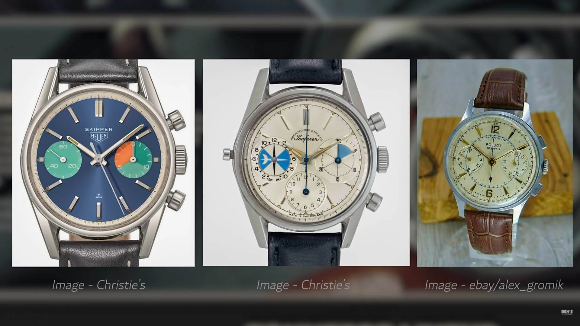
According to a press release they sent me, this design pays homage to the likes of the Heuer Skipper and the Abercrombie & Fitch Seafarer and, to some extent, the telemeter chronographs of days past.
This is evident from the inclusion of those twisted lugs and the turquoise accents on the subdials. I have to say, David, if you're reading this, you've absolutely nailed it this time. I think this looks better than both of the watches that inspired it, which is a challenging feat to pull off. The punchy teal hues perfectly complement the lighter tone across the rest of the dial. The sizing of the chapter ring is spot on, effortlessly providing added interest without becoming distracting clutter.
Quality Control
Unlike last time, there are no QC issues to speak of, with all the markers and the chronograph hand lining up perfectly, and they even went the whole way and altered the logo. I critiqued the previous model for having too much unnecessary text below the logo.
They must have seen my review as, like I suggested, they have gone and removed the word Sweden from this one. Not to toot my own horn, but I think it looks much cleaner now, especially when the watch is on camera, as it sits comfortably between the hands when they're in the popular photography position nearing ten past ten.
Handset
Additionally, the second hand here is much more clean and simple, foregoing the unusual and somewhat distracting N logo present on the last one. While less extravagant, I prefer this implementation, and I like the combination of the distinctive blue body and white tip, which isn't found on many competing watches out there.
The syringe handset remains only this time in what appears to be a lighter silver color to match the tone of the markers beneath. To the naked eye, I can't see any flaws on them either, though perhaps the super-macro lens will reveal something from an ant's perspective.
Colorway
The only inherent drawback to the color scheme is that legibility isn't the best, as the lume-filled central portions do somewhat blend into the background. Nevertheless, outside of that, I'm not sure there's anything I'd change; it's clear to me that plenty of time and careful planning has gone into generating this dial, and the results speak for themselves. In fact, all three of the other color variants look equally good from the product shots.
Are you listening fashion watch brands and AliExpress specials? This is what a homage watch looks like, ok! Not a copy and paste of a famous watch and labeling it a 'homage.' This Tonnerre has taken small bits of design inspiration yet has been spun off into something creative. I like that.
Marketing
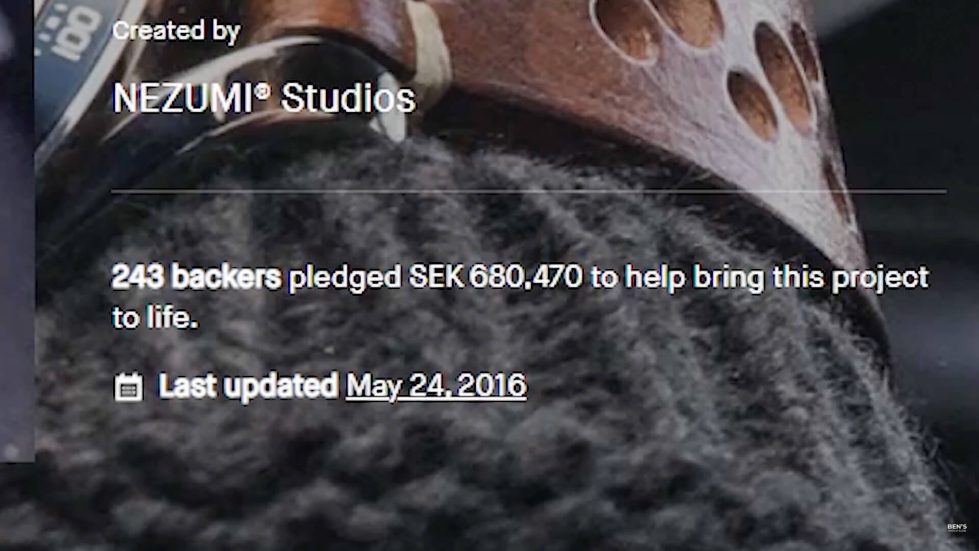
I also like the absence of ridiculous 'affordable luxury' adverts packed with extreme claims about the build quality and materials used. Counterintuitively, this brand was started on Kickstarter back in 2015. While it didn't receive as many backers as other more infamous projects, Nezumi doesn't appear to have built a brand upon lies in the process.
As consumers, we need to make a conscious effort to support these transparent companies that are making great products, rather than those who simply rely on aggressive social media marketing to shift units.
Watch Strap
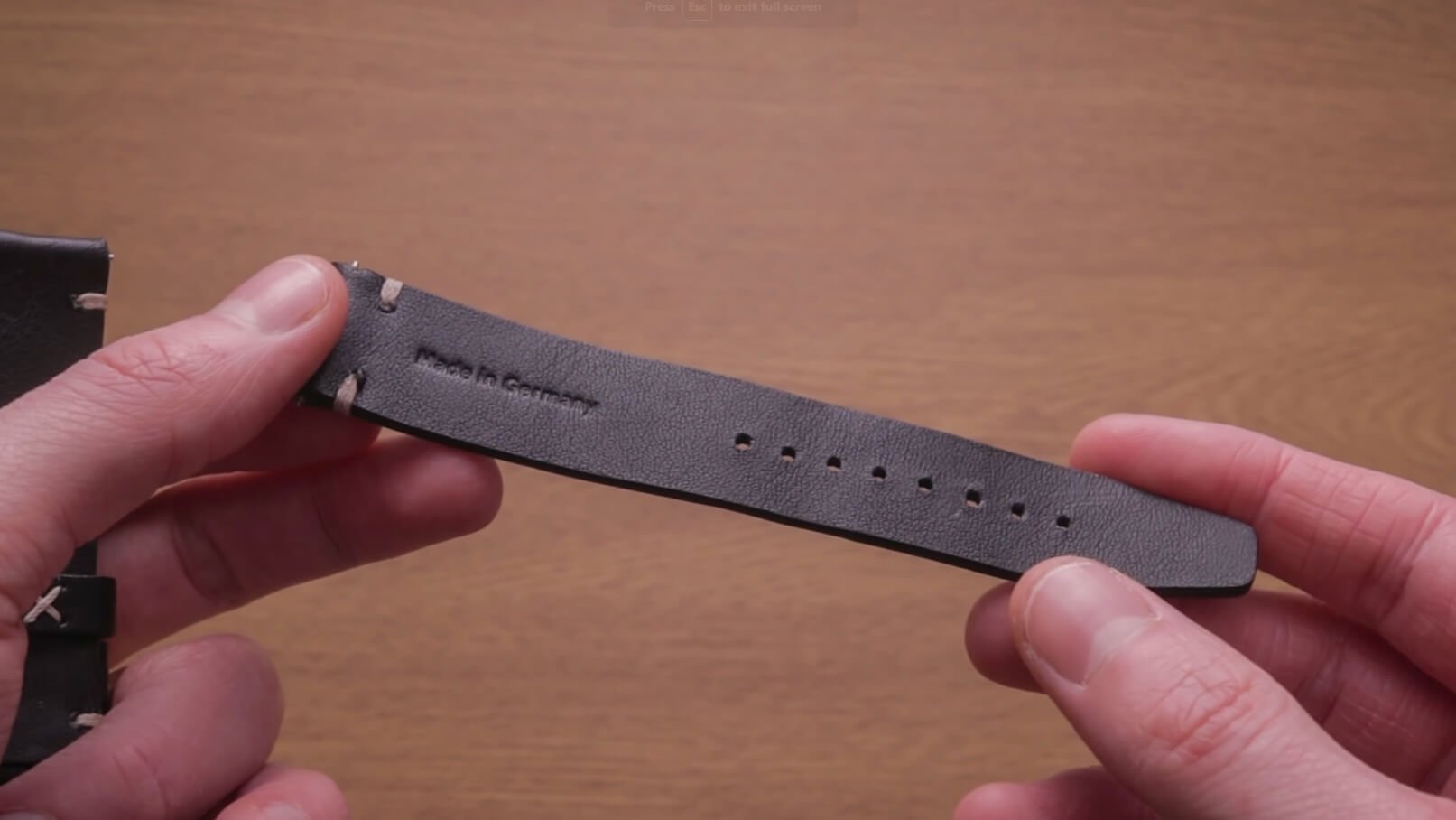
Don't worry, I haven't forgotten the strap, though. This one is equivalent to that I tried last time, meaning it's reasonable, though not great. For the most part, this is wearable, but it's still a little loose on my skinny wrist, even on the last hole.
Given that this compact watch will likely attract those with average or smaller-sized arms, I think it could do with being shorter, or the option to simply order the watch with a different-sized strap would be nice. I switched mine out for this affordable 20mm sailcloth strap instead, which looks even better.
Final Thoughts
You can get cheaper mecha-quartz watches than this £250 Tonnerre, but I doubt you'll find many that so thoroughly deliver on their promises. If this improvement rate continues, I'm very excited to see what Nezumi pumps out next.


