Daniel Wellington Iconic Link Automatic Review – The Worst Value Watch You Can Buy?
(This page features affiliate links, for more information, click here.)
What happens when the worst watch brand on social media produces a complex, mechanical watch?
Unsurprisingly, you get one of the worst value watches you can buy.
What was that? I've already made that post?
Aah, I forgot about that one.
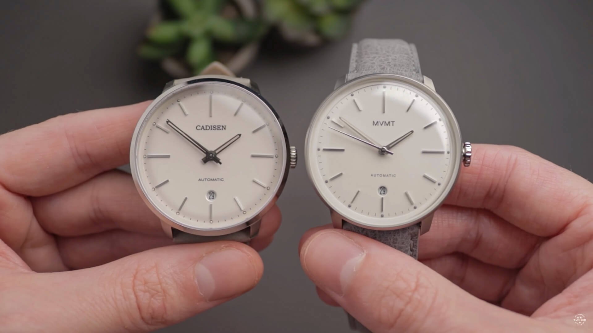
Yeah, a year or two back, MVMT, one of the most hated watch brands, decided to release the "Arc" a minimalist automatic watch with an even bigger profit margin. Unfortunately, I found a similar watch on AliExpress, for a fraction of the price, with a superior crystal; rendering it obsolete. The Arc was better than the previous junk pushed out by the company, but it wasn't nearly worth the steep asking price.
Cadisen Automatic vs MVMT Arc
It seems their competitors have been inspired nonetheless. Daniel Wellington, often labeled as the 'worst watch brand ever' due to their grocery-store levels of quality, has now jumped in with their own minimalist automatic watch, which they're promoting as their "most advanced timepiece to date."
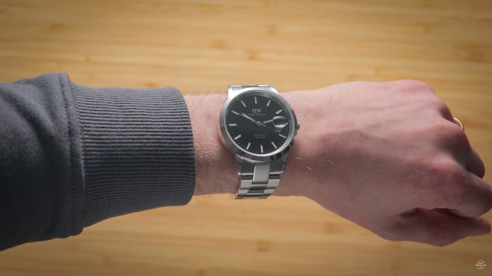
Daniel Wellington Iconic Link Automatic
Don't worry, despite the hype, this isn't a $300 watch or anything; it's closing in on $500!
In what world could this possibly justify a $459 retail price?
Well, this one, it seems. Yeah, to the dismay of my wife, I actually went and bought one!
As the #1 critic of these fashion brands over the years, I think it's my responsibility to acknowledge when they're improving their products.
But has Daniel Wellington made any improvements? Let's take a closer look.
Dimensions & Case Style
The Iconic Link looks just like the lower-end quartz watches from square on, though there are some notable differences in shape as you rotate it. Unfortunately, the one thing previous DWs had going for them, their super thin case, is now absent.
Obviously, the automatic movement within is bigger than a battery-powered quartz module, though this Iconic Link is almost double the thickness of the older models, at 11.7mm excluding the cyclops, leading to a far chunkier look and feel. It's got a 40mm diameter and 48mm lug to lug.
The lugs curve away steeply this time, making it more viable for smaller wrists than their frisbee-like quartz watches, which only suited giant arms.
From above, I think this watch looks better than those too, due to the slightly thicker bezel and smaller dial, which give less of that pancake-like effect.
The rest of the case, however, is much uglier than the MVMT Arc, or most others at this price for that matter. It feels like a generic afterthought essentially. The whole thing has the same polishing all over it and doesn't stand out in any way from far cheaper watches.
In some ways, it reminds me of the underwhelming case found on the Seiko Presage I reviewed, but that piece had a beautiful dial to bail it out. Unfortunately, this one doesn't.
Dial Design
Yeah, the dial and design here are just bland. You could say it's minimalist, but I'm not so sure.
The MVMT Arc, while still pretty generic, did have some interesting elements, such as a skeletonized handset, a circular date wheel, and grey pips at the circumference, providing a semblance of personality.
This DW, on the other hand, looks like the result of a 30-second design contest. Perhaps they hired a kid, as they didn't even manage to draw the D the correct way!
It's not hideous, but nothing here shouts 'affordable luxury' to me. You can buy cheap Seiko 5s that offer the same look, arguably with better-looking touches, for a fraction of the cost of this one. Heck, the first Seiko I ever reviewed on this blog way back when looked pretty similar but had a nice sunburst effect for 1/5th of the price. DW couldn't even be bothered to use an enlarged or unique marker at 12 to discern it from the others; they're all the same basic rectangles.
The background has no texture, no enamel finish or sunburst, and just looks like black paper, if anything.
I personally don't think this design was made with tastefulness in mind, but rather with cost reduction as the main priority.
They certainly didn't have usability in mind either. While the microscopic crowns were forgivable on the quartz models, given that you'd rarely ever be touching them, the equally small wheel on this automatic is a confusing choice. As far as challenging crowns go, this is second only to completely smooth ones, good luck gripping this when trying to wind your watch.
Watch Movement
But what exactly will you be winding? On their website, it's just listed as a "Japanese automatic movement." If it's not Swiss at this price, surely it must be something fairly decent, right?...right?
Well, inside this pricey watch is a Miyota automatic...no, not the reputable 9000 series, no, the far cheaper, aging, and problem-ridden 8215.
While reliable in terms of timekeeping, this movement has nonetheless garnered a negative reputation in the community due to the painfully loud rotor noise and the high frequency of stuttering issues resulting from an inherent flaw in the movement's design. Unlike the 9000 series, it doesn't have a particularly high beat rate even when the unit is functioning properly, so the second-hand motion doesn't look as pleasing.
Miyota 8215 Movement
For brands wanting to forego the bottom-of-the-barrel Chinese Tongji movement, so they can market their watch as having 'Japanese parts' to increase their asking price, this is the minimal viable product.
What's worse is that Daniel Wellington couldn't even be arsed to decorate the movement in any way and were too lazy to spend the additional small fee for a custom or lasered rotor. The barebones movement here is identical to that in watches that retail for a fraction of this watch, such as the Cadisen automatic, which I compared to the MVMT automatic a year or two back. When alongside many European microbrands, who are sometimes criticized for not competing effectively with big brands or Chinese specials, even watch newbies could spot the disparity in presentation.
To be clear, while this budget movement has some obvious shortcomings, these can be accepted for a watch costing 100, maybe 200 dollars. But at this price point? It's a complete rip-off. There are a plethora of better options that should have been used instead, to ensure users didn't have to deal with aforementioned issues or that would have justified the inclusion of the exhibition case rear to begin with. To me, it feels like the point of the see-through window has been defeated; either that or it's just there to show how hosed you got when purchasing the Iconic automatic. Even MVMT had the decorated 821A version inside their automatic at a lower price point.
Bracelet
Fortunately, there are some aspects of this watch that are less scandalous. The first is the bracelet. Surprisingly, this is good! It integrates fairly well with the case, is easily removable thanks to the drilled lugs, and is constructed of solid steel links throughout. This bracelet uses the butterfly-style deployant system, leaving a sleeker look with no traditional clasp. Typically I don't like these as they don't permit any adjustments, which usually leads to an imperfect fit. Fortunately, DW included two smaller links, allowing for more precise tinkering. This means I've found a comfortable fit with the Iconic, which I wasn't expecting beforehand.
Of course, is this quality expected for any watch over about $200? Yes, yes it is. We can't be piling praise on them for doing their job with this component.
Watch Crystal
Similar can be said of the sapphire crystal. While this provides top-tier scratch protection, and I'm pleased they haven't used a gimmicky substitute like other brands (go check out our scratch test post if you haven't already), for some reason, I'm really not feeling the inclusion of the cyclops here.
On a dive watch, sure. On a tool watch, that's understandable. On a super minimalist dress watch like this? To me, it sticks out like a sore thumb. Frustratingly, it's not even aligned properly. At least to my eyes, it's tilted clockwise slightly and is too high, leaving the date window sitting toward the bottom of the cyclops when looked at from square-on. A lot of crystals come with these pre-fitted, so perhaps it's more the supplier's fault than Daniel Wellington's. Still, this could easily have been avoided had they not bothered with the cyclops, though those with failing eyesight may appreciate the inclusion nonetheless. At least they didn't go full scam mode with a mineral crystal.
The watch also has 100m of water resistance, which is nice to have but not a necessity for what feels like a dress watch. For those wondering, despite the Japanese movement and European branding, this watch is actually made in China.
Final Thoughts
The Daniel Wellington Iconic Link Automatic is a watch that should cost $150 or $200 at the very most…but doesn't. It's their best watch by far, but even with discount codes, it's insultingly poor value for money. While the MVMT Arc was overpriced, it wasn't nearly this bad. I can't think of any aspect of this watch that justifies the price it's selling for right now.
By heading to eBay's completed listings section, you can see how terrible the resale value of the quartz watches is compared to their RRPs. I wonder if this automatic will perform even worse.


