Casio A1000 Review - Is This STEEL Casio The Watch We've Been Waiting For?
(This page features affiliate links, for more information on them click here.)
One thing. We keep asking for one thing…some steel.
No, I’m not talking about grit and determination, I’ve already got that in abundance boys! I’m on about full metal construction on Casio watches. Especially on their cheaper digital models, Casio tends to utilise resin, despite featuring a metallic finish on some designs. While this can often look near-identical, the performance isn’t so comparable. Resin usually scratches very easily and ultimately won’t last as long as stainless steel, but the compromise is expected given most of these digital options are under £30.
For a while, the watch community has been willing to pay a little more for a metal version of some of these legendary watches and finally, we have one…or do we? Well, I’ll be taking a look at two of the new Casio A1000 series watches, to examine whether these fit the bill or are more of a missed opportunity.
I say ‘new’ but I really mean new by Casio standards as I believe these were released late last year. Based on the selection of colourways, these appear to be unisex watches and Amazon have kindly sent me the two most ‘masculine’ versions for review. These are currently about £80 to £90 each and I’ll link both throughout this article in case you want to grab one of them.
As they’re part of this ‘vintage’ line, they both came in identical slimline boxes; sheathed inside an internal leather pouch. This looks cool but isn’t over the top.
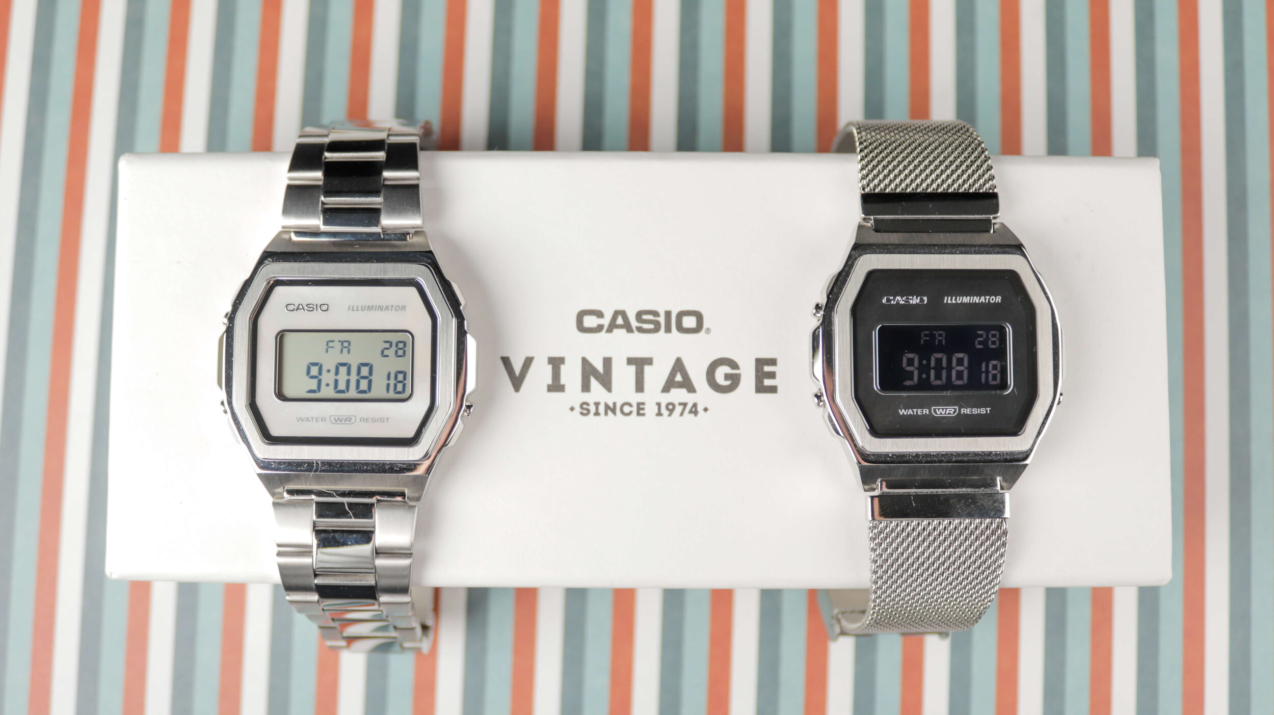
You can see I opted for the white A1000D and the black A1000M, both of which are technically listed as women’s watches on Amazon, but you can ignore that for reasons we’ll discuss.
Dimensions
They’re essentially the same watch and as such have identical case proportions. You have a 38mm width, 7.7mm depth and a 39.6mm lug to lug. On-wrist, the A1000 wears like a slimmer, wider and slightly heavier A168. The additional weight makes the A1000 feel like a more premium watch, though it removes some of that on-wrist disappearance that you get with the lighter models. It is still really comfortable though and should serve most average to small wrists very nicely. If you’re someone with a larger wrist, who has typically struggled with some of the older, smaller Casio’s; this A1000 could also be just wide enough to not look dwarfed on your arm.
WATCH CASE
Unlike some of the traditional digital offerings, this one has a more modern, almost futuristic look about it, which makes me wonder why it is part of the vintage series. Perhaps this design is inspired by one of their older watches? The closest I could find was this Casio Marlin AW-42, which still isn’t particularly similar.
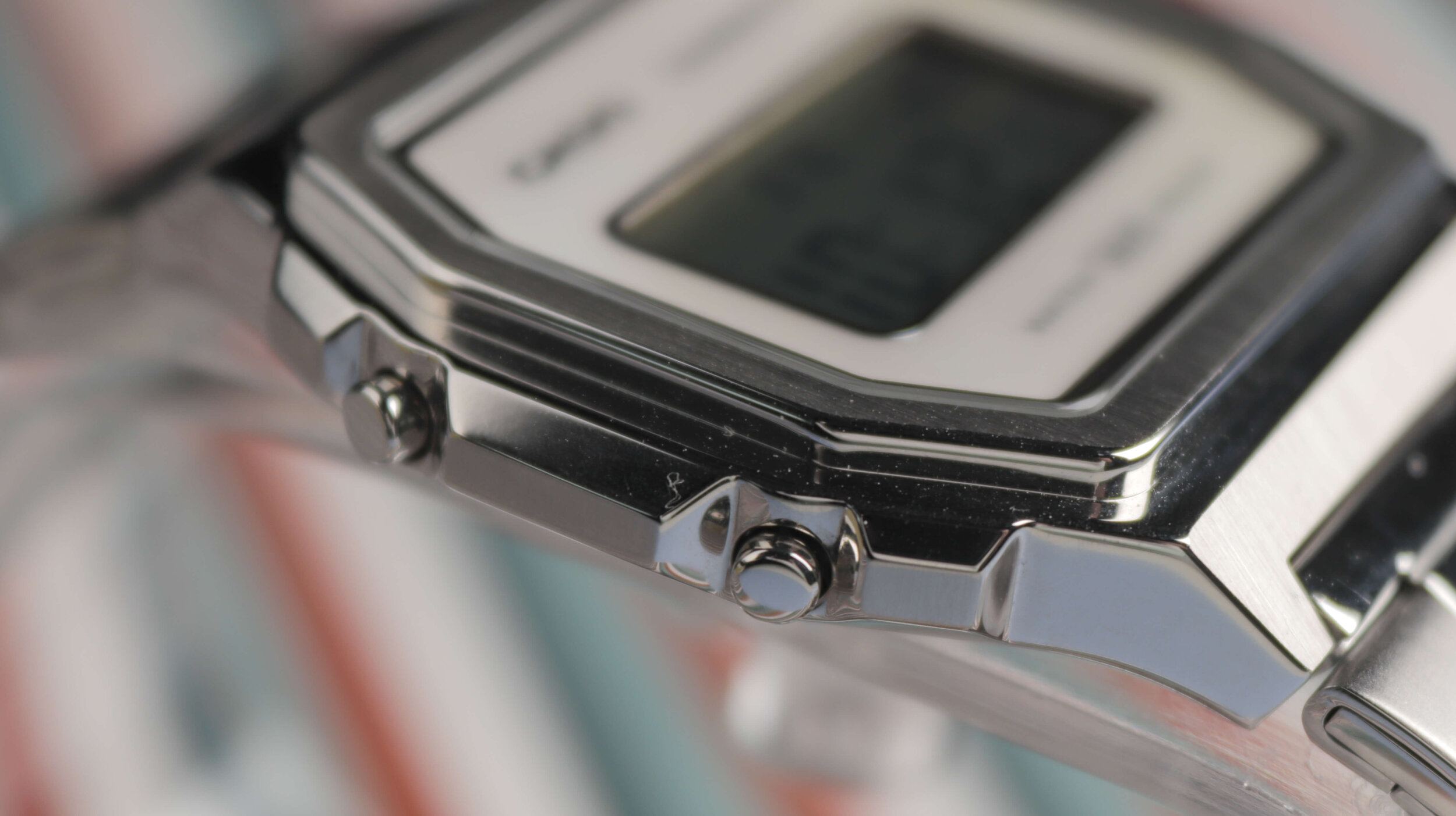
Here we have some bulges between the pushers, which double up as guards, as well as a stepped design featuring a raised bezel. There is also an alternating brushed and polished finish across each section of the case, showcasing that this is easily the highest quality non- G-shock Casio available. While I like the look of the case, I’m disappointed by the water resistance rating. Considering the price increase, I hoped for at least 5 or 10ATM, but unfortunately, it’s on the basic 3ATM splash resistance. This brand does have a good reputation for aquatic performance so they could be lowballing their estimations to avoid displeasure; though, it’s a thorn in the watch’s side nonetheless.
GLASS
Fortunately, they have upgraded the crystal. The A1000 is fitted with a piece of mineral glass over the display, which will provide more scratch resistance than the acrylic in most of their cheaper options. While this is appreciated and is the standard at this sort of price point; I feel that a piece of sapphire would have been the perfect inclusion here. I can’t help thinking that Casio hasn’t fully realised this premium digital concept. They made the upgrade to steel, which we were all waiting for, but if this were paired with better water resistance and sapphire, I think they would be flying off the shelves.
WATCH DESIGN
So, in some areas, it seems they have gone with form over function. However, I will give them credit as the display surround does look extremely sleek. This removes all of the additional, unnecessary text and clutter that inhabits the other digital models and gives a much more contemporary, attractive look.
As you can see from the online product shots these have a mother of pearl backdrop, but in person, the effects are less pronounced than I anticipated. The white A1000D is the more vibrant of the two, though the pink hues shown in some renderings are far more muted in reality; with this unit featuring an equal amount of blue and green tinges. I wonder if those tones were boosted in photoshop to appeal to more women? The A1000M is so subtle that you won’t notice it at all unless you reflect it in direct sunlight. When these were released, I saw commentary online from men concerned that the mother of pearl could make these look to feminine and unwearable; but with these two models, that seems like a non-issue. I don’t think it looks like you’re wearing a women’s watch, especially when combined with the size increase over the traditional resin A series of alternatives.
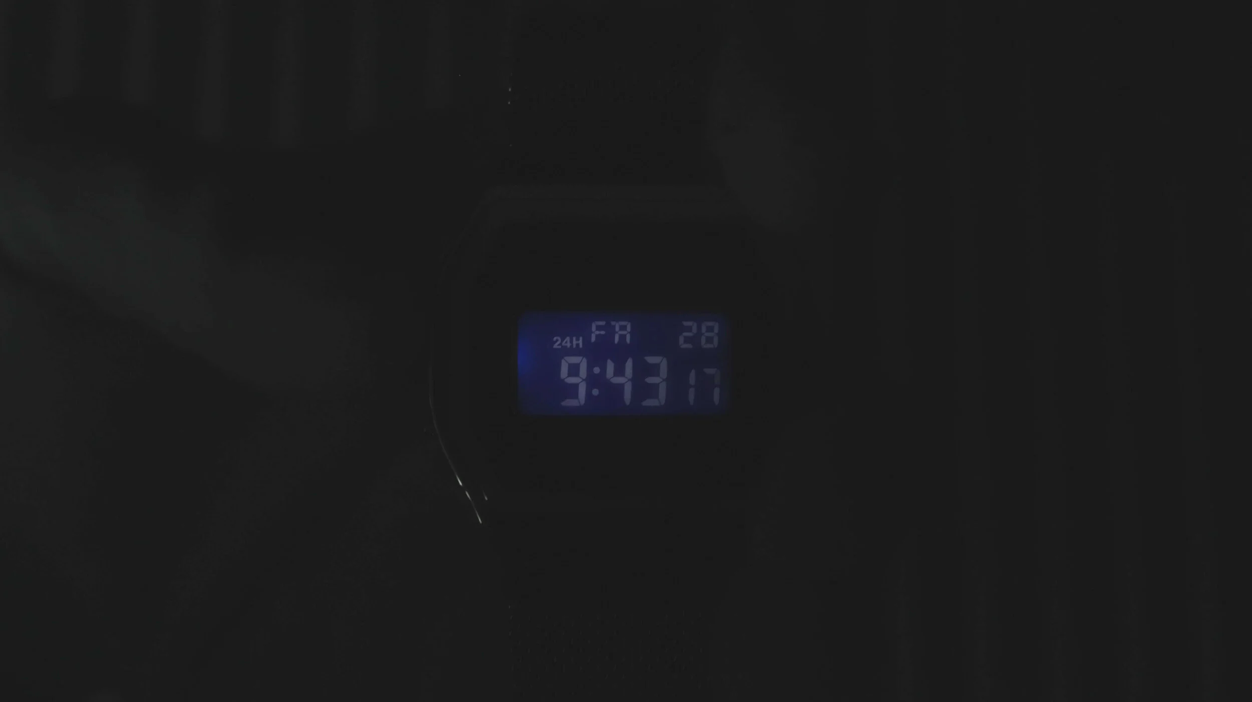
Personally, I prefer the darker aesthetic of the A1000M, but it has a truly fatal flaw. The negative display is really, really poor. Even when square on, it’s so dim that it’s borderline illegible. I remember I thought the inverted display on the Casio B640 struggled, but this is much worse and outright kills the practicality of the watch. That on the A1000D is completely fine and much the same as the F91 and other models, so thankfully it’s useable. I’ve already seen videos of people modding their A1000M and switch the display, to make the watch readable. I think this shouldn’t even need to be happening and it’s unacceptable that you can barely read the time on an almost £100 watch. Both watches feature excellent backlights, which is great to see, but for the aforementioned issues, I can only recommend the A1000D; unless you happen to have a substitute display lying around.
BRACELET
The steel bracelets are certainly an area that I’m not complaining about. These are both big improvements over some of the more budget pieces and while nothing spectacular, they do the job. A mesh bracelet, very similar to that on the A700 is the default with the darker model, whilst an oyster-style bracelet is fitted to the lighter one.
The mesh bracelet is more flexible than that on its smaller brother, with glossy sections at each end which integrated with the case finish very nicely. The alternative features folded links with L pins. While it sounds cheap and is certainly time-consuming to adjust, it’s much better than expected when on-wrist. It’s very comfortable, doesn’t pinch many hairs and looks very smart. The press-release clasp functions well but frustratingly you get no micro-adjustment holes for fine adjustments. Is it wearable and useable for most people? Definitely. They both also feature quick-release tabs, so you can switch them out with ease.
FINAL THOUGHTS
I’m left wondering, are these the watches we’ve been waiting for? There are several things here to like, such as steel construction and more refined design. I also really appreciate the slight size increase, along with the slimness, which makes this look like it means business whilst remaining a very easy-wearer.
Despite this, my gut feeling is that Casio hasn’t quite nailed it. They’ve gone more down this ‘fashiony’ route, which I wasn’t expecting when I heard they had finally released some steel digitals. I think this approach is certainly going to appeal to some people; those looking for an attractive first digital watch will likely enjoy the clean design language here, rather than the complicated and often convoluted approach taken with the other retro models. The A1000 looks and feels much more premium too and certainly would not be mistaken for a child’s watch.
However, for those of us after a simple, durable daily beater watch; I’m not sure this is a big step up from the likes of the A700, which I reviewed earlier this year. Sure, the case and glass are a little better, but what else is there to show for the price increase?
I know from my viewership stats that it’s overwhelmingly us guys interested in these little watches, so I’d love them to bear that in mind with future steel releases. If they created a new model designed solely for men, with the tweaks I mentioned before and at the same retail price, they would have a huge hit on their hands. Either way, I think they are generally on the right track. They’ve produced a steel digital watch that isn’t a £400 G-Shock and they have landed on an aesthetically pleasing design too. This A1000D, in particular, is a good watch and an enjoyable piece on-wrist, but this concept needs more time in the oven to ensure some people aren’t left with the taste of a cash-grab in their mouths.


